Overview

The DynamicDocs API provides an effective way to create bespoke pdf documents in bulk with ability to include graphics and logic in the documents.

This is done by writing templates in Latex on this website and then calling the API with json data payload, which consists of dynamic data for the document. Once the call has been the API response will be provide a link to the progress json which in turn will provide a link to download the document.

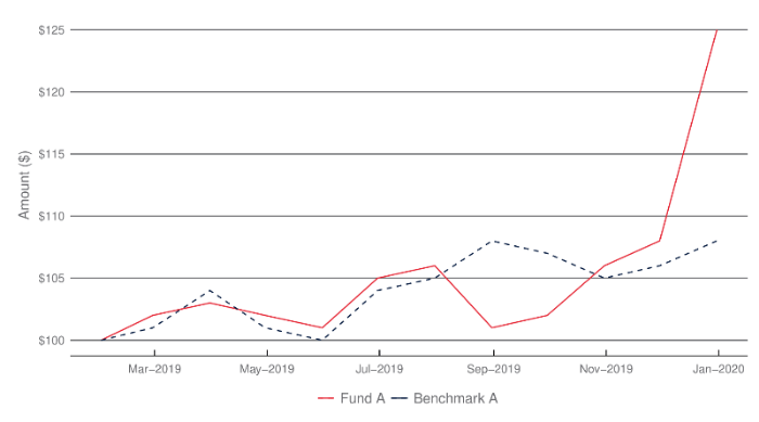
Example of Line Chart

The following example shows how to create a line chart:

{ "fundData": [ { "navDate": "2019/01/31", "Fund": 100, "Benchmark": 100 }, { "navDate": "2019/02/28", "Fund": 102, "Benchmark": 101 }, { "navDate": "2019/03/31", "Fund": 103, "Benchmark": 104 }, { "navDate": "2019/04/30", "Fund": 102, "Benchmark": 101 }, { "navDate": "2019/05/31", "Fund": 101, "Benchmark": 100 }, { "navDate": "2019/06/30", "Fund": 105, "Benchmark": 104 }, { "navDate": "2019/07/31", "Fund": 106, "Benchmark": 105 }, { "navDate": "2019/08/31", "Fund": 101, "Benchmark": 108 }, { "navDate": "2019/09/30", "Fund": 102, "Benchmark": 107 }, { "navDate": "2019/10/31", "Fund": 106, "Benchmark": 105 }, { "navDate": "2019/11/30", "Fund": 108, "Benchmark": 106 }, { "navDate": "2019/12/31", "Fund": 125, "Benchmark": 108 } ] }
\documentclass[a4paper]{article} \usepackage[top=1cm, bottom=1cm, left=1cm, right=1cm,]{geometry} \usepackage[utf8]{inputenc} \usepackage[T1]{fontenc} % Font setup \usepackage[default,scale=0.95]{opensans} \begin{document} \vspace{0.5cm} <<lineChart-1, cache=FALSE, fig.height=5, fig.width=9>>= params$fundData$navDate <- as.Date(params$fundData$navDate,format='%Y/%m/%d') ggplot(data=params$fundData)+ geom_line(aes(x=navDate, y=Fund, color =' Fund A '), linetype='solid')+ geom_line(aes(x=navDate, y=Benchmark, color =' Benchmark A ' ), linetype='dashed')+ scale_colour_manual(breaks = c(" Fund A "," Benchmark A ") ,values=c("#00183F","#E72533")) + theme_economist() + theme(panel.background = element_rect(fill = "#FFFFFF", colour = '#FFFFFF'),plot.background = element_rect(fill = "#FFFFFF", colour = '#FFFFFF'),axis.title.x=element_blank()) + theme(panel.grid.major = element_line(colour = "#6D6E71", size=0.5))+ theme(panel.grid.minor = element_blank())+ theme(axis.text = element_text(colour = "#6D6E71"))+ theme(legend.position="bottom", legend.title=element_blank(),legend.background=element_rect(fill = "#FFFFFF", colour = '#FFFFFF'))+ theme(legend.text=element_text(size=12,color="#6D6E71"),legend.key = element_rect(fill = "#FFFFFF"))+ theme(axis.title.y=element_text(colour = "#6D6E71",size=12,margin=unit(c(0,0.2,0,0.2),units="cm"))) + theme(legend.spacing=unit(0.1, units = "cm"),legend.margin=margin(t = 0.1, unit='cm')) + labs(y="Amount ($)") + scale_x_date(breaks = seq(as.Date("2005-01-01"), as.Date("2025-01-01"), by="2 months"), labels=date_format("%b-%Y"))+ scale_y_continuous(breaks = pretty(params$fundData$Fund,n=8),labels=dollar_format(prefix="$",big.mark = " ")) @ \vspace{0.5cm} \end{document}
line-chart-Screenshot

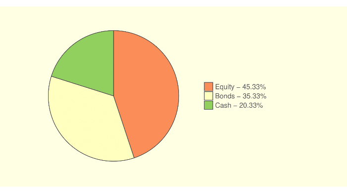
Example of Pie Chart

The following example shows how to create a pie chart:

{ "expenses" : [ { "name": "Home Loan", "weight": 9800 }, { "name": "Credit Card", "weight": 6000 }, { "name": "Medical Insurance", "weight": 2750 }, { "name": "Home Expenses", "weight": 4500 }, { "name": "Other", "weight": 8750 }, { "name": "Entertainment", "weight": 2000 } ], "assetAllocation" : [ { "name": "Equity", "weight": 45.334 }, { "name": "Bonds", "weight": 35.333 }, { "name": "Cash", "weight": 20.333 } ] }
\documentclass[a4paper]{article} \usepackage[top=1cm, bottom=1cm, left=1cm, right=1cm,]{geometry} \usepackage[utf8]{inputenc} \usepackage[T1]{fontenc} % Font setup \usepackage[default,scale=0.95]{opensans} \begin{document} \vspace{0.5cm} <<pieChart-1, cache=FALSE, fig.height=5, fig.width=9>>= allocationData = params$assetAllocation colnames(allocationData) = c('Name','Weight') allocationData$legend = paste(" ", allocationData$Name," - ", formatC(allocationData$Weight,format="f",digits=2),"% ",sep="") allocationData$fraction = allocationData[["Weight"]]/ sum(allocationData[["Weight"]]) allocationData = allocationData[order(allocationData[["Weight"]],decreasing=TRUE), ] allocationData$ymax = cumsum(allocationData$fraction) allocationData$ymin = c(0, head(allocationData$ymax, n=-1)) pos = cumsum(allocationData[["Weight"]])- allocationData[["Weight"]]/2 allocationData$legend = factor(allocationData$legend,levels=allocationData$legend[order(allocationData[["Weight"]],decreasing=TRUE)]) ggplot(allocationData, aes(fill=factor(legend), ymax=ymax, ymin=ymin, xmax=2, xmin=1)) + geom_rect(colour="grey30") + coord_polar(theta="y") + xlim(c(1, 2)) + theme(panel.background = element_rect(fill = "#ffffe5", colour = '#ffffe5'), plot.background = element_rect(fill = "#ffffe5", colour = '#ffffe5'),axis.title.x=element_blank()) + scale_fill_brewer(palette = "RdYlGn", direction = 1) + theme(legend.position="right", legend.title=element_blank(),legend.background=element_rect(fill = "#ffffe5", colour = '#ffffe5'))+ theme(legend.text=element_text(size=13,color="#58595b"))+ theme(panel.grid=element_blank()) + theme(axis.text=element_blank()) + theme(axis.text.x=element_blank()) + theme(axis.ticks=element_blank(),axis.line=element_blank())+ theme(plot.margin = unit(c(0.5,5,0.5,2),units="cm")) @ \vspace{0.5cm} \end{document}
pie-chart-Screenshot

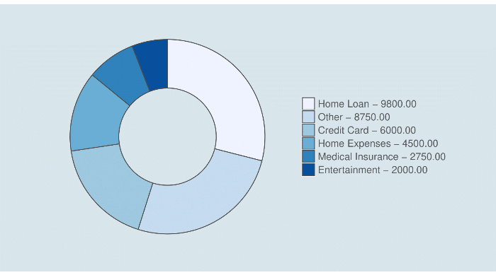
Example of Doughnut Chart

The following example shows how to create a doughnut chart:

{ "expenses" : [ { "name": "Home Loan", "weight": 9800 }, { "name": "Credit Card", "weight": 6000 }, { "name": "Medical Insurance", "weight": 2750 }, { "name": "Home Expenses", "weight": 4500 }, { "name": "Other", "weight": 8750 }, { "name": "Entertainment", "weight": 2000 } ], "assetAllocation" : [ { "name": "Equity", "weight": 45.334 }, { "name": "Bonds", "weight": 35.333 }, { "name": "Cash", "weight": 20.333 } ] }
\documentclass[a4paper]{article} \usepackage[top=1cm, bottom=1cm, left=1cm, right=1cm,]{geometry} \usepackage[utf8]{inputenc} \usepackage[T1]{fontenc} % Font setup \usepackage[default,scale=0.95]{opensans} \begin{document} <<doughnutChart-1, cache=FALSE, fig.height=5, fig.width=9>>= expensesData = params$expenses colnames(expensesData) = c('Name','Weight') expensesData$legend = paste(" ", expensesData$Name," - ", formatC(expensesData$Weight,format="f",digits=2)," ",sep="") expensesData$fraction = expensesData[["Weight"]]/ sum(expensesData[["Weight"]]) expensesData = expensesData[order(expensesData[["Weight"]],decreasing=TRUE), ] expensesData$ymax = cumsum(expensesData$fraction) expensesData$ymin = c(0, head(expensesData$ymax, n=-1)) pos = cumsum(expensesData[["Weight"]])- expensesData[["Weight"]]/2 expensesData$legend = factor(expensesData$legend,levels=expensesData$legend[order(expensesData[["Weight"]],decreasing=TRUE)]) ggplot(expensesData, aes(fill=factor(legend), ymax=ymax, ymin=ymin, xmax=2, xmin=1)) + geom_rect(colour="grey30") + coord_polar(theta="y") + xlim(c(0, 2)) + theme(panel.background = element_rect(fill = "#d9e6ee", colour = '#d9e6ee'), plot.background = element_rect(fill = "#d9e6ee", colour = '#d9e6ee'),axis.title.x=element_blank()) + scale_fill_brewer(palette = "Blues", direction = 1) + theme(legend.position="right", legend.title=element_blank(),legend.background=element_rect(fill = "#d9e6ee", colour = '#d9e6ee'))+ theme(legend.text=element_text(size=13,color="#58595b"))+ theme(panel.grid=element_blank()) + theme(axis.text=element_blank()) + theme(axis.text.x=element_blank()) + theme(axis.ticks=element_blank(),axis.line=element_blank())+ theme(plot.margin = unit(c(0.5,2,0.5,2),units="cm")) @ \vspace{0.5cm} \end{document}
doughnut-chart-Screenshot

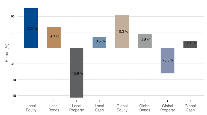
Example of Bar Chart

The following example shows how to create a bar chart:

{ "oneYearReturns": [ { "AssetClass": "Local Equity", "Return": 0.125 }, { "AssetClass": "Local Bonds", "Return": 0.0666 }, { "AssetClass": "Local Property", "Return": -0.156 }, { "AssetClass": "Local Cash", "Return": 0.0351 }, { "AssetClass": "Global Equity", "Return": 0.103 }, { "AssetClass": "Global Bonds", "Return": 0.045 }, { "AssetClass": "Global Property", "Return": -0.08 }, { "AssetClass": "Global Cash", "Return": 0.0215 } ] }
\documentclass[a4paper]{article} \usepackage[top=1cm, bottom=1cm, left=1cm, right=1cm,]{geometry} \usepackage[utf8]{inputenc} \usepackage[T1]{fontenc} % Font setup \usepackage[default,scale=0.95]{opensans} \begin{document} <<barChart-1, cache=FALSE, fig.height=5, fig.width=9>>= assetClassDF <- params$oneYearReturns assetClassDF$AssetClass <- factor(assetClassDF$AssetClass,levels = assetClassDF$AssetClass) assetClassDF$label = paste(format(round(100*assetClassDF$Return,1), digits=2),"%") assetClassDF$AssetClassLabel <- gsub(" ", "\n", assetClassDF$AssetClass) assetClassDF$AssetClassOrderedLabel = factor(assetClassDF$AssetClassLabel,levels=assetClassDF$AssetClassLabel) assetClassDF$AssetClassLegendLabel = paste0(assetClassDF$AssetClass," - ",format(assetClassDF$Return*100,digits = 2,trim=TRUE),"%") ggplot(data=assetClassDF,aes(x=AssetClassOrderedLabel, y=Return)) + geom_bar(aes(fill = AssetClass), width = 0.6, stat = "identity")+ geom_text(aes(label=label, vjust=-0.25),color='#111111',position=position_stack(0.45)) + scale_fill_manual(breaks = assetClassDF$AssetClassLegendLabel, values = c("#004B8D","#BA8C60","#606163","#7091AF","#C3AE9B","#A0A1A2","#8491B0", "#555555")) + theme_economist()+ theme(panel.grid.major = element_line(colour = "#D3D3D3", size=0.5))+ theme(legend.position="none", legend.title=element_blank(),legend.background=element_rect(fill = "#FFFFFF", colour = '#FFFFFF'))+ theme(legend.text=element_text(size=12,color="#6D6E71"),legend.key = element_rect(fill = "#FFFFFF"))+ theme(axis.title.y=element_text(colour = "#6D6E71",size=12,margin=unit(c(0.2,0.2,0,0.2),units="cm"))) + theme(panel.background = element_rect(fill = "#FFFFFF", colour = '#FFFFFF'), plot.background = element_rect(fill = "transparent", colour = '#FFFFFF',size = 0) ,axis.title.x=element_blank())+ theme(axis.text.x=element_text(colour = "#6D6E71",size=12)) + labs(y="Return (%)") + scale_y_continuous(breaks = pretty(assetClassDF$Return,n=8),labels = 100*pretty(assetClassDF$Return,n=8)) @ \vspace{0.5cm} \end{document}
bar-chart-Screenshot

More Resources

For more informations on creating charts, please consult the ggplot2 official page or the ggplot2 cheat graphic.